Project Overview
The AI Exploration Targeting project aims to leverage AI deep learning to identify correlations within various geological survey data used in the mining industry to discover new mineral deposits previously undetectable by traditional methods.
My role was to design an intuitive data visualization for the AI-processed data, known as VPS (VRIFY Probability Score), within a 3D real-world space. The visualization needed to be human-centered, easy to comprehend, and complement traditional mining data visualization styles.
VRIFY, a startup SaaS company serving the mining industry, primarily focuses on improving how mining companies communicate complex data and information by way of interactive presentation tools. The project aimed to reduce exploration costs, uncover new deposits, and minimize environmental impacts associated with traditional exploration methods. The system was successfully launched at the PDAC conference in March 2024, receiving positive feedback for its innovation, leading to an influx of new projects utilizing this technology.
Problem Statement
The challenge was to create a sophisticated yet user-friendly visualization for AI-driven exploration data. Traditional geological data visualizations often fail to fully convey complex data correlations in an intuitive manner. Our goal was to design a visualization system that could present the AI-processed data (VPS) in a 3D real-world context, making it easy for users to interpret and act upon. The project aimed to address these limitations by utilizing AI deep learning to uncover deeper connections within the data.
The primary design objectives were:
1. To create a visualization that accurately represents AI-generated probabilities of mineralization.
2. To ensure the visualization is visually distinct yet complementary to traditional mining data styles.
3. To make the data accessible and actionable for geologists and investors, reducing unnecessary exploration and costs.
By achieving these objectives, the project aimed to improve the efficiency and effectiveness of mining exploration programs, enhancing both economic and environmental outcomes.
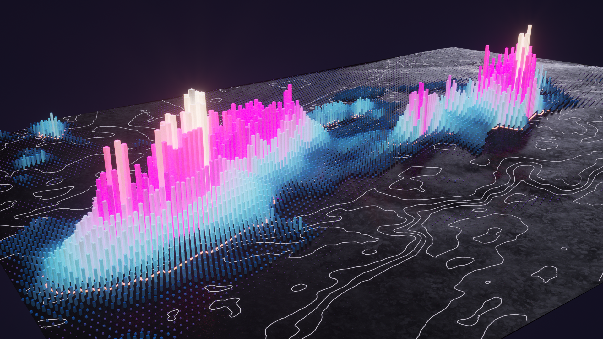
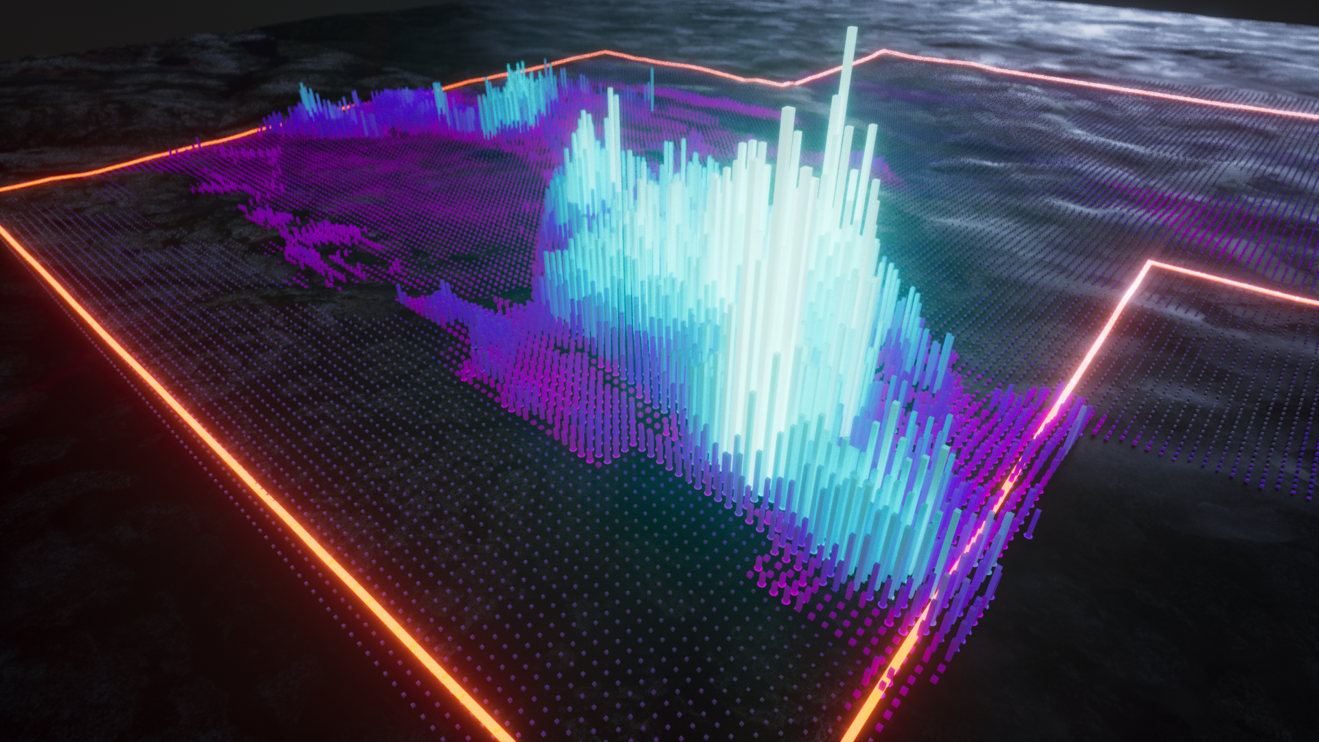
A final rendered proof of concept of the VPS data visualization
Research & Insights
The research phase involved several key steps to ensure the development of an effective and innovative data visualization system for the VPS data.
Design Systems & AI Visualizations
The initial research focused on existing AI design systems like SHAP (SHapley Additive exPlanations) graphs to identify elements that could be adopted for the VPS visualization. White papers on data visualization from Google and Adobe provided a foundation for creating the new VPS visualization.
Mining Application Visualizations
To ensure compatibility, we researched how data is visualized in mining applications such as ArcGIS, Vulcan, and Surpac. This helped develop a design system for VPS that, while visually distinct, complemented traditional mining data visualization styles, creating a seamless user experience.
Futuristic Design Focus
A significant focus was placed on making the VPS visualization appear futuristic. We explored advanced data visualization styles, including properties like colour, shape, motion, scale, and luminosity, to harness the power of technologies available within the VRIFY application.
Technical Constraints
Understanding the limitations of the VRIFY application’s technology was crucial to ensuring successful 3D visualization of the VPS data. Considerations of memory usage, textures, and rendering performance were essential to developing a high-quality and performant visualization.
By leveraging these research insights, we created a data visualization system that was not only functional but also visually striking and innovative, meeting the project’s goals.
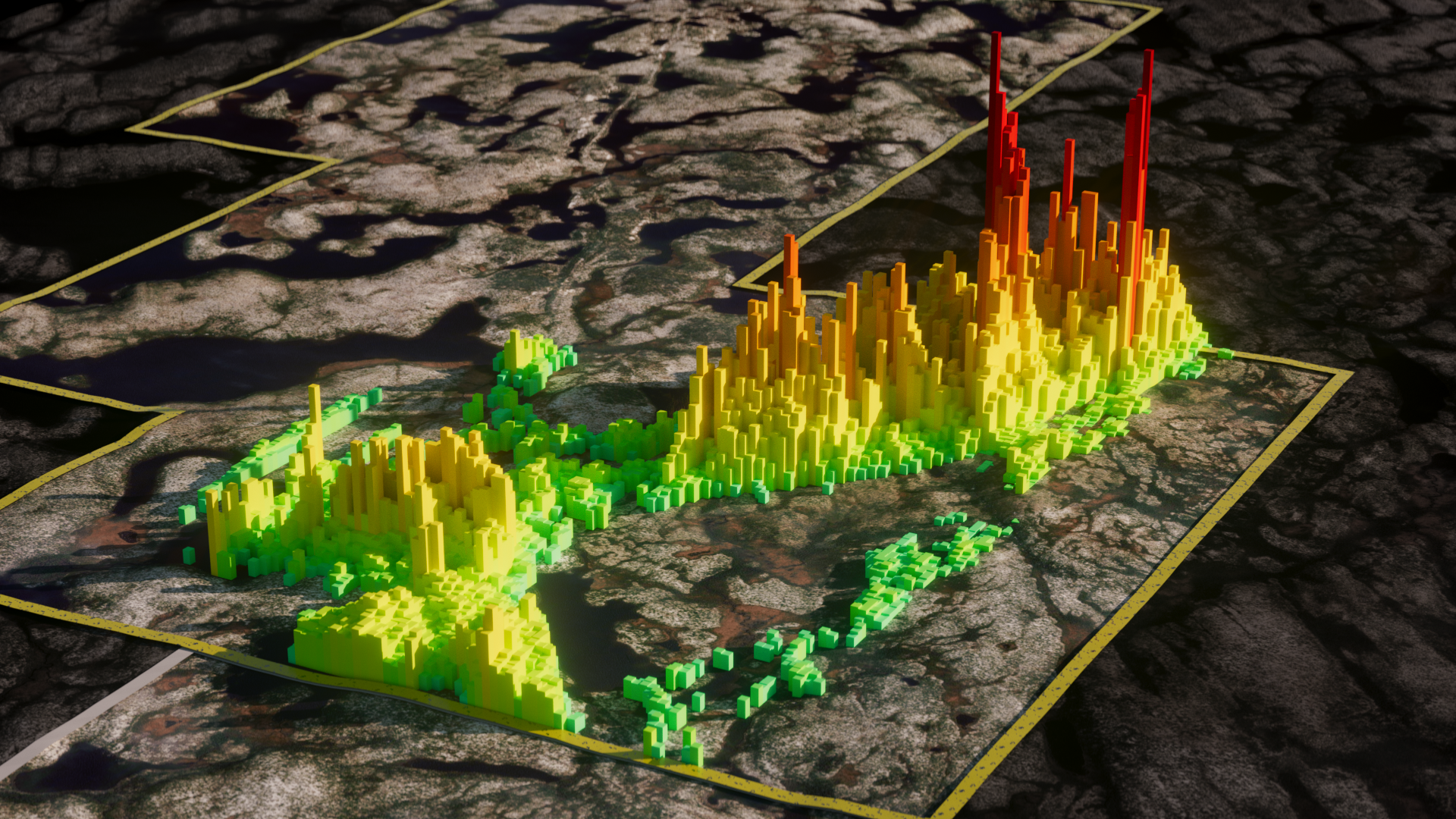
An early iteration in colour study, exploring using colour gradient ramps that align with prominent geoscience software applications
Design Process
The VPS data was provided in a CSV spreadsheet with headers for Easting, Northing, Depth, and VPS Value (0.000 - 1.000). Each data point corresponded to a probability of mineralization at a specific 3D coordinate, with higher values representing higher probabilities that mineralization exists at the targetted coordinate. The challenge was to design a visualization that was intuitive for users familiar with exploration survey data while making the VPS data easy to understand.
Colour
Colour was crucial for representing the VPS data effectively. Initially, we considered bucketing the data into ranges with distinct colours but found this required too much manual adjustment. Instead, we used a sequential gradient ramp inspired by SHAP graphs, choosing a blue/pink gradient extending to white for high-probability values. This gradient stood out against traditional rainbow colour ramps, making high-probability areas identifiable as “white hot.”
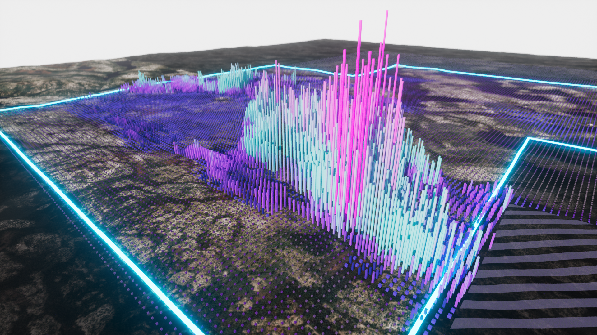
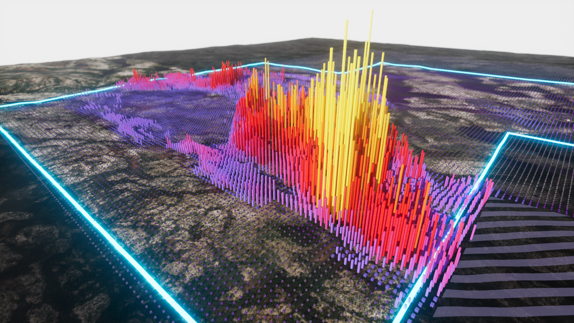
Interact with the slider to explore the colour study, SHAP inspired (left) vs "Plasma" colour gradient (right)

Geometry Shape
Given VRIFY’s technology constraints (using WebGL and iOS), we optimized polygon count for performance. We experimented with shapes like cubes, triangular prisms, and hexagonal structures. Cubic geometry was chosen for its flexibility and performance efficiency, working well for both “At Surface” and “At Depth” configurations.
Geometry Scale
We used the VPS value as a secondary visualization method for controlling the geometry size of each data point. This allowed us to increase the contrast of high-value points against lower value targets, drawing the audience's eye to the most significant areas of interest.


Interact with the slider to see the effect of applying gradiated scale to the geometry, no scaling (left) vs VPS-driven scale (right)
Luminosity
We incorporated luminosity to further highlight high-probability VPS values. This property, rarely used in traditional data visualizations, added a glowing effect to high-probability points, enhancing visibility and the futuristic aesthetic. While not currently available as a supported property in the VRIFY product, we found value in exploring how we could use various material properties to further enhance the visuals in alignment with our key objectives.
Integration & Distinction
To distinguish between “hard data” and AI-generated VPS data, we modified materials and visual properties of the primary content in the 3D model. This included background, topography, satellite imagery, mining boundaries, and drill collars. The transition mimicked a light-to-dark mode switch, with added contour lines and a fenced border around the VPS data points.

Interact with the slider to see the transition between the "hard data" visual environment and the AI-generated environment
Technology & Tools
For the VRIFY AI - Exploration Targeting project, we employed advanced technologies and tools to create an efficient and visually compelling data visualization system.
Houdini
Our technical artist developed a parametric system within Houdini to manage the VPS datasets, connecting each VPS value to properties such as colour, geometry dimensions, position, and luminosity. We integrated switches to adjust the visualization for “At Surface” or “At Depth” points.
Integration of Colour Gradients
Visualizing the full gamut of colours in the gradient ramp was a challenge. Traditionally, client data like drilling assays and geochemical samples used up to 8 colour buckets. Visualizing the VPS data, with over 200 colour variations, was not feasible with this approach.
We created a 1px wide gradient ramp of our VPS sequential colour gradient. This image texture was used in Houdini, mapping the bottom to a VPS value of 0 and the top to 1. Each VPS data point was assigned a 1x1px UV map positioned along the gradient relative to its value. This method improved performance by reducing required materials from over 200 to just one and allowed easy swapping of colour ramps for experimentation.
Optimization & Export
Post-processing in Houdini involved optimizing the model by removing unnecessary polygons (e.g., bottom faces of cubes for “At Surface” data) and adjusting for asset-specific scale requirements. The processed data was exported as an Alembic file to Cinema 4D, where additional components like topography and drill strings were integrated before exporting the final model to the VRIFY application for real-time interactive viewing on web and iOS.
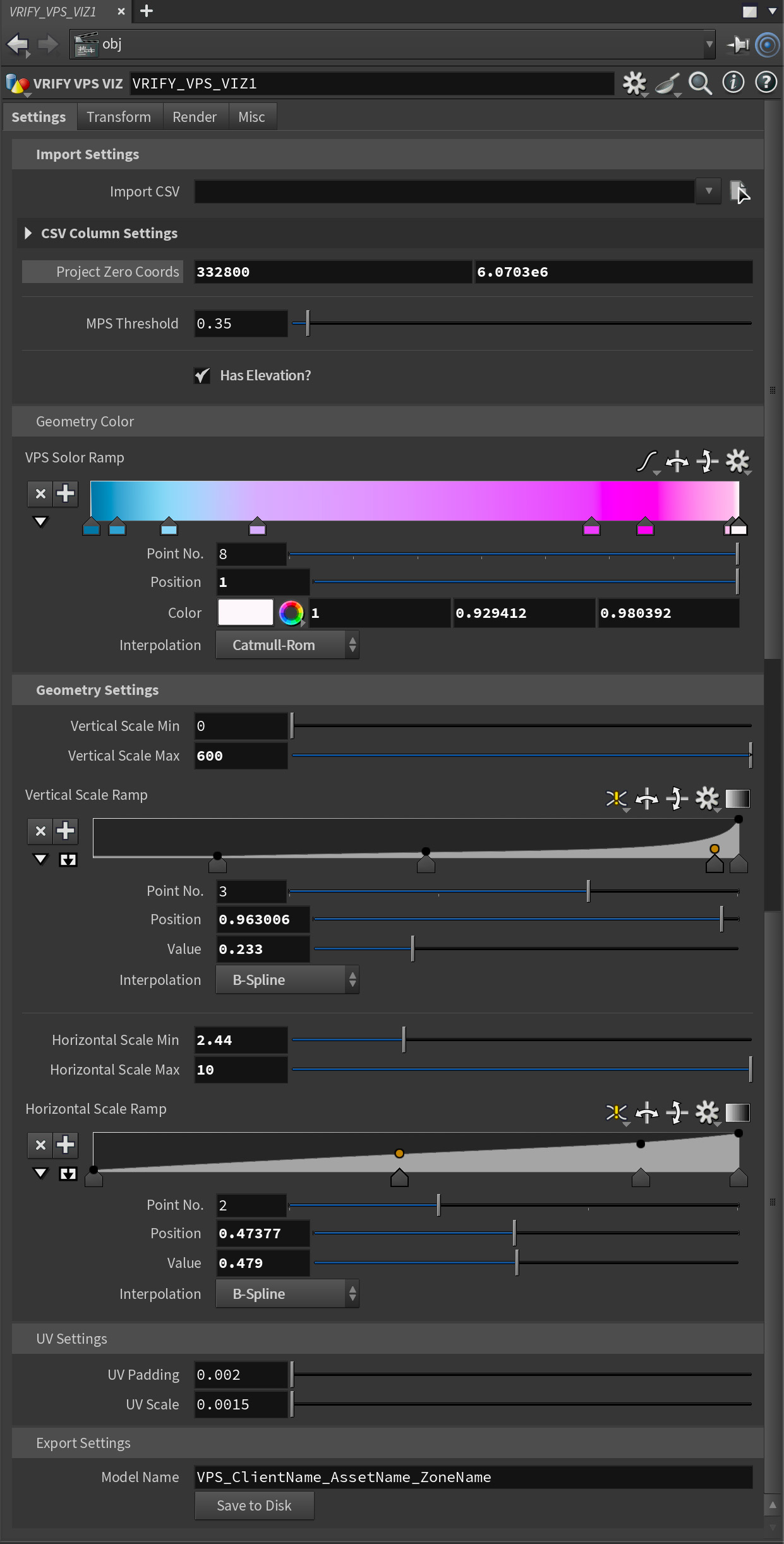
UI of the VPS Tool Parameters in Houdini
Deliverables
The key deliverables for the VRIFY AI - Exploration Targeting project included VPS data visualizations for four clients, each targeting different minerals. These visualizations were tested across various geological zones to ensure consistency and interpretability.
Main Visual Elements
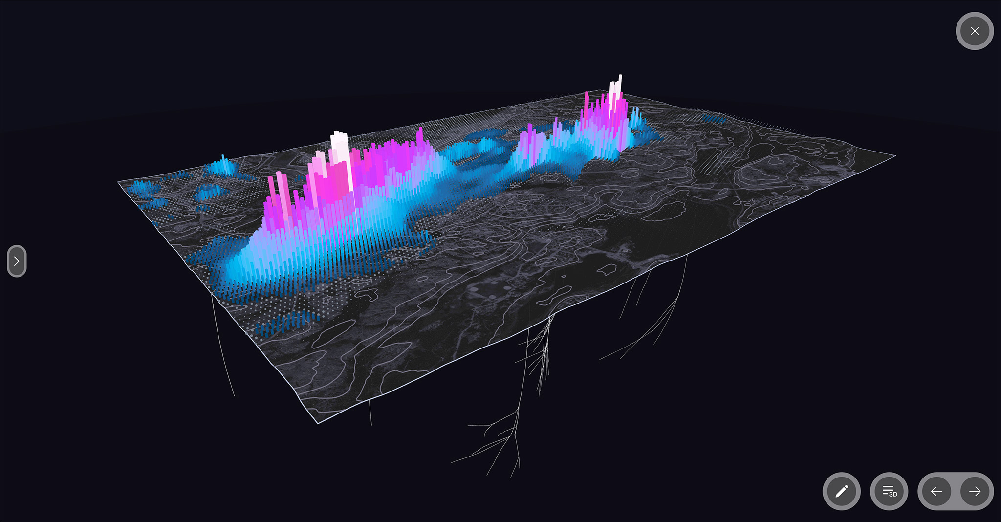
The VPS data visualization employed gradient-mapped cubic structures, effectively representing the probability of mineralization. These cubes varied in size and colour intensity based on the VPS value, with high-probability areas creating clustered, volumetric shapes.
The visualizations used a blue-magenta-white gradient ramp to indicate probability, with higher probabilities appearing “white hot” and lower probabilities fading into darker blue tones. While luminosity material properties were unavailable to use in the product, applying an additive blend mode to the material was a hacky way that were able to achieve a similar result. We implemented this to high-probability points to make them glow, enhancing visibility and the futuristic aesthetic.
The final visualizations were integrated into the VRIFY application, an interactive 3D presentation tool. This allowed clients to explore the data in a real-world spatial context, providing a comprehensive view of the high-probability target zones.
Specific Features & Highlights
The visualizations included a bird’s eye view of the landscape, overlaid with VPS data. The dark and desaturated satellite imagery, combined with contour lines, provided a clear reference for the high-probability zones.
Visualizations were tailored for different clients, ensuring the system worked across various geological contexts. This customization allowed for more accurate and actionable insights for each client’s specific exploration programs.
By using a 1px wide gradient ramp and optimizing the geometry, the visualizations maintained high performance and reduced the number of materials required. This innovation allowed for efficient rendering and better user experience within the VRIFY application.
Testing & Feedback
Throughout the development of the VRIFY AI Exploration Targeting visualization, we engaged in an iterative testing process with four different clients who partnered with VRIFY. This collaborative approach provided us with valuable feedback and allowed us to refine the design in real-time.
Client Review Sessions
We conducted multiple review sessions with our clients to present the initial visualizations and gather their input. These sessions were critical in understanding client preferences and requirements.
A/B Testing
During the client testing phase, we employed A/B testing to compare different gradient ramps and identify which options resonated best with users. This method helped us align the final visualization with client expectations while adhering to our brief of creating a futuristic and distinctive design.
Feedback Received
The feedback from clients was overwhelmingly positive. They appreciated the clarity and visual appeal of the VPS data visualization, noting that it was both easy to understand and visually engaging. Specific points of feedback included:
• Simplicity and Clarity: Clients found the visualization simple to understand, which was a primary goal of the project.
• Aesthetics: The visual style was described as eye-catching and exciting, fulfilling the requirement to differentiate from traditional mining data visualizations.
• Gradient Preferences: Through A/B testing, clients expressed a preference for gradient ramps that enhanced the futuristic look and provided clear distinctions between high and low probability areas.
Design Iterations
Based on the feedback, we made several key iterations:
• Gradient Refinement: We adjusted the gradient ramps to better align with client preferences, ensuring the colours were both visually appealing and functional.
• Enhancements for Clarity: Minor tweaks were made to enhance the clarity of the visualization, such as adjusting the luminosity and scale properties to better highlight key data points.
By incorporating client feedback and iterating on the design, we were able to produce a final visualization that not only met but exceeded client expectations, ultimately contributing to the success of the VRIFY AI Exploration Targeting system.
Results & Impact
The VRIFY AI Exploration Targeting system’s launch at the PDAC conference in March 2024 was a massive success. VRIFY’s CEO and Director of AI Targeting delivered the keynote presentation, explaining the VPS visualization and its potential as a revolutionary tool for geologists in exploration.
The final concept of the VPS data visualization, presented within the VRIFY interactive web app
Key Metrics & Success Indicators
• Client Validation: One of our test clients, who had conducted a geophysical survey prior to reviewing the VPS data visualization, found that the VPS data accurately indicated a low probability of mineralization in the surveyed area. This validation highlighted the efficacy of the VPS model in predicting mineralization, as the subsequent geophysical survey confirmed the VPS results.
• Cost Savings: Exploration companies using the VPS visualization can avoid expending resources on low-potential areas, resulting in significant cost savings. This efficiency enables companies to allocate budgets more effectively towards high-potential zones.
• Environmental Impact: The precision of the VPS data visualization reduces the need for extensive and invasive exploration practices. By accurately identifying target zones, companies can minimize environmental disruption and focus on areas with higher mineralization potential.
Impact on Clients & End-Users
• Informed Decision-Making: Exploration companies now have access to a sophisticated tool that enhances their understanding of geological assets. The VPS visualization empowers geologists to make more informed decisions, optimizing exploration efforts and reducing the risk of unproductive drilling.
• Investment Opportunities: Institutional and retail investors benefit from the clear and accessible presentation of mineralization potential through the VPS visualization. This democratizes access to exploration data, allowing investors to identify high-potential mining companies without needing technical expertise in geological surveys.
Overall Success
The VRIFY AI Exploration Targeting system represents a significant advancement in the mining exploration industry. By combining AI-driven data analysis with intuitive visualization, the system not only improves exploration efficiency and reduces costs but also fosters more sustainable and environmentally responsible exploration practices. The positive reception and validation from clients underscore the transformative potential of the VPS visualization in revolutionizing how geological data is utilized and understood.
Reflection
Successes
Innovative Colour Mapping
The implementation of a single gradient ramp image to drive the colour values of the VPS data was a groundbreaking approach. This method not only enhanced the visual representation but also opened up new possibilities for applying similar techniques to other data types.
Flexible Parametric System
Setting up the parametric visualization system in Houdini provided significant flexibility. This system allowed us to efficiently iterate on design developments and quickly load new datasets, ensuring high production performance and adaptability.
Challenges
One of the major challenges was selecting an appropriate colour palette for the VPS data. Internal opinions varied widely on colour preferences, making it difficult to reach a consensus.
As the design manager, I leveraged my experience to navigate through the differing opinions on colour selection. By clearly explaining the rationale behind the chosen colours and demonstrating how they met the project’s requirements for clarity, aesthetic appeal, and functionality, I was able to guide the team towards a cohesive decision.
Lessons Learned
Effective Communication
Clear communication and justification of design choices are crucial, especially when dealing with subjective elements like colour. Ensuring all stakeholders understand the design process and the reasons behind each decision can help mitigate conflicts and align the team.
By reflecting on these successes and challenges, we can apply these insights to future projects, ensuring continued innovation and effective collaboration.
Flexibility in Design Tools
Utilizing flexible design tools like Houdini can significantly enhance the ability to adapt and iterate quickly. This flexibility is essential for handling diverse datasets and responding to feedback efficiently.
Innovation Through Constraints
The challenge of managing extensive colour data led to an innovative solution that not only resolved the immediate issue but also provided a scalable approach for future projects. Embracing constraints can drive creative problem-solving and lead to valuable breakthroughs.
Vancouver/Whistler
British Columbia, Canada
Phone: +1 (604) 418-6339
Email: matt.hayden.clark@gmail.com
LinkedIn: /matthewhaydenclark

Grab a coffee with Matthew!
© Matthew Clark 2024